If you ever have the chance to speak with a logo designer, you would know how tedious and time consuming the whole task could be. It isn’t an act of sudden creative outburst, but one that needs great thought, ideation, and understanding of the brand. And that’s exactly what a great logo will represent.
Here are some brands whose logos had meanings beyond that of their names. Some that were always in front of our eyes but our amateur eyes couldn’t trace them, while some others that we knew existed but couldn’t quite understand why. Read on, and get gyaani…
1. Baskin Robbins has enough flavours to last you for 31 days of the month
The idea of coming out with 31 flavours of ice cream, back in 1953 is what took Baskin Robbins to places. And though it is in pink, most people do not notice the 31 hidden in the name.
![]()
2. Beats by Dre used the most basic human shape
The circle within a circle with the name of the company could not get simpler. But it isn’t. The circle is a human head side profile, and the smaller circle is the headphone.

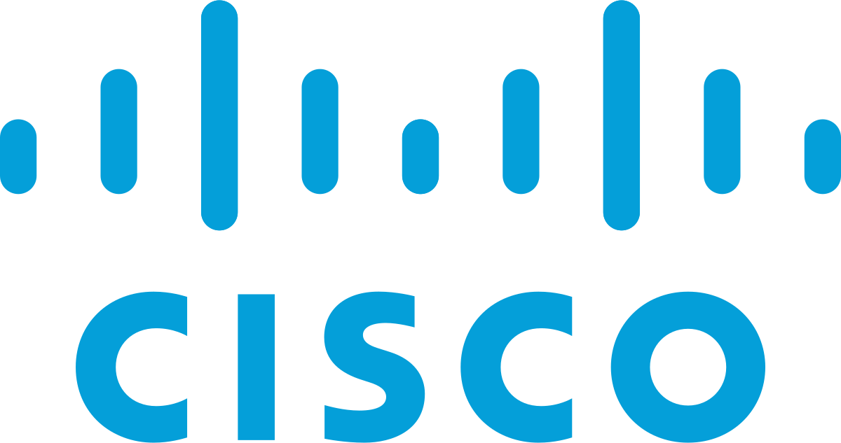
3. Cisco is true to its roots…
Not only does this worldwide leader in networking for the Internet represent electromagnet with the blue lines, but also represents the Golden Gate Bridge of San Francisco. Also, just in case you didn’t know, Cisco gets its name from San Fran’cisco’.
4. A to Z…
Amazon sells everything… You can see than by the yellow arrow that begins on a and goes to z. And, the joy of online shopping can be seen in the stylised arrowhead, that represents a dimple.

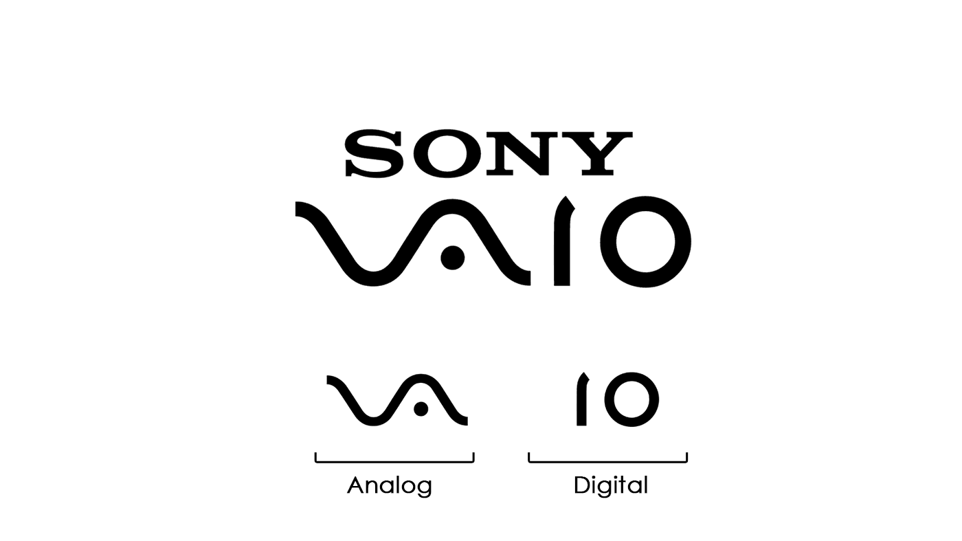
5. Sony Vaio is an embrace all…
This Visual Audio Intelligent Organiser is an amalgamation of both analog and digital. The wave-like V and A represent analog waves and the I and O represent the binary or digital coding! Smart eh?
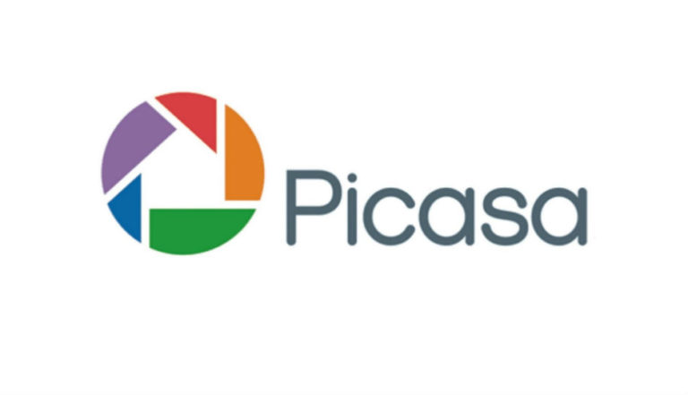
5. Picasa is your image home, isn’t it?
The logo of Picasa represents just that and a camera shutter, of course. Take a look at the negative space inside the colourful shutter, you’ll see a ‘casa’, which in Spanish means home.
6. London Symphony Orchestra, with style
The logo reads the abbreviation ‘LSO’, but if you look at it unfocused on the alphabets, you’ll see an orchestra conductor.
![]()
7. Le Tour De France on a cycle
Two messages hide in the logo. One is the obvious ‘r’ that looks like a cyclist, with the yellow circle as the front wheel. But but, the second less obvious representation of the orange circle, is the sun… meaning that the event takes place only in the day time.
![]()
8. Fed Ex… Always moving forward
Fed Ex, the incredibly popular shipping company, has a hidden arrow between E and X. Signifying their idea of always moving forward!
![]()
9. Toblerone and its honey flavour…
Toblerone shows a mountain, symbolising the Matterhorn Mountain in Switzerland. The mountain has a bear hidden on its left face, that symbolises the unique honey flavour in its chocolate, and that it comes from the ‘city of bears’.
![]()
10. Gillette sharp razor
The razor company, looks like, has used their sharpest razor to cut the G and I.
![]()
So next time you come across a logo that you are unfamiliar with it, take a closer look, or a detached look, and you may find some creative idea hidden!